
Fifth Third Bank
Website Redesign
Overview
This home page redesign was an assignment given to me as part of the interview process for a UX internship. Spoiler alert: I got the job!
The Assignment
Pick any tech, finance, or SaaS website of your choosing and redesign the homepage in a Figma mockup. This includes the navbar, hero section, calls to action, body, and footer.
Context and Constraints
The final product of this assignment was a one-screen mockup. It was over the course of one weekend, so compared to the other projects in my portfolio which are more in-depth prototypes, this project more resembles a design sprint. In each step, you’ll find insight into what I would do to expand on this project if given more time.
Roles
Everything (personal project): UX Researcher, Information Architect, UI Designer, etc.
Timeline
October 18-20, 2025
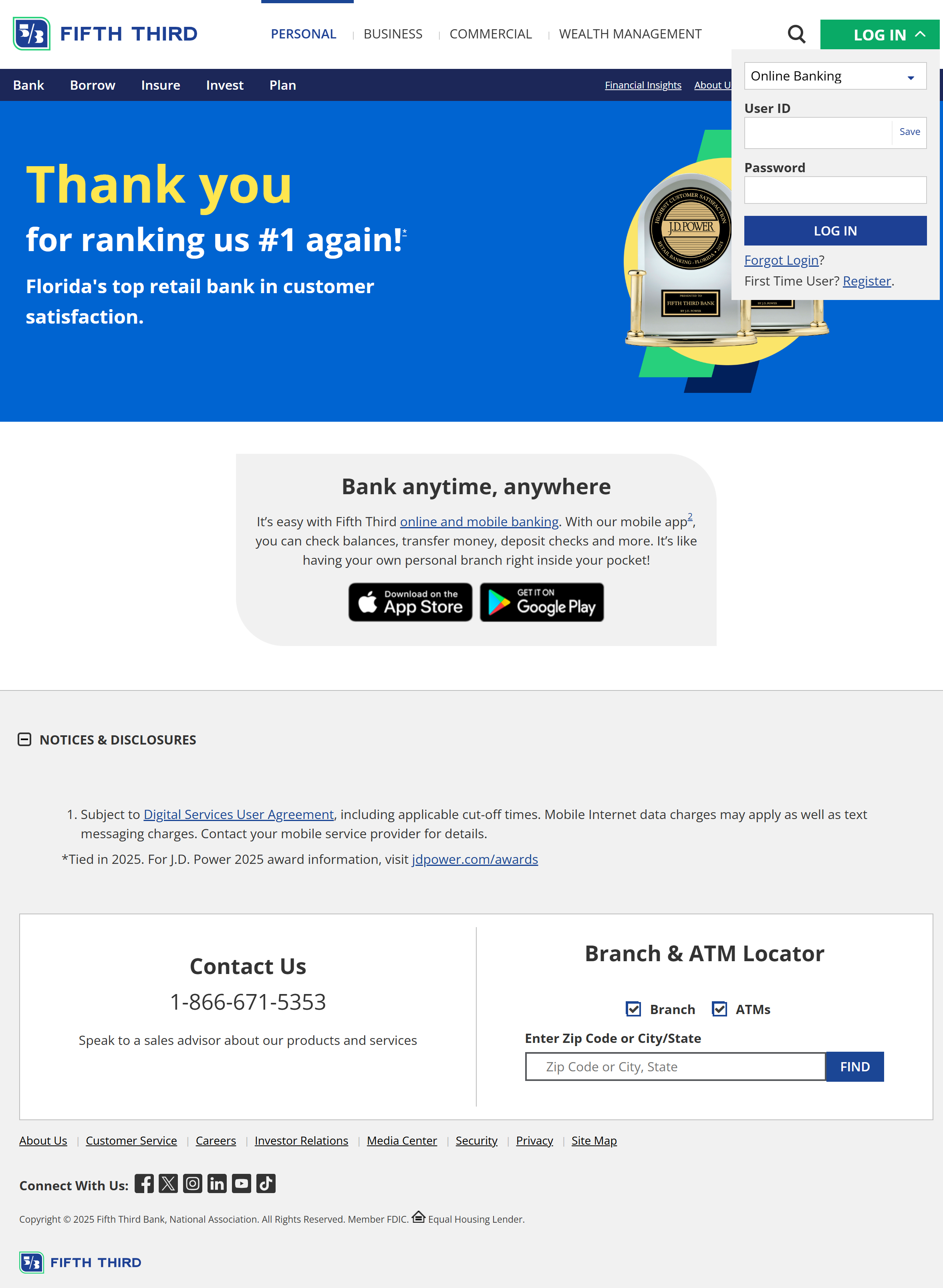
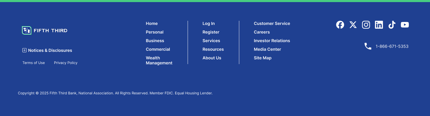
The Before
This is the current home page of the Fifth Third Bank website— the first search result when you google “fifth third bank”. There is much to be desired here. After analyzing the ideal users, I will go over the main issues that need to be addressed.
Research
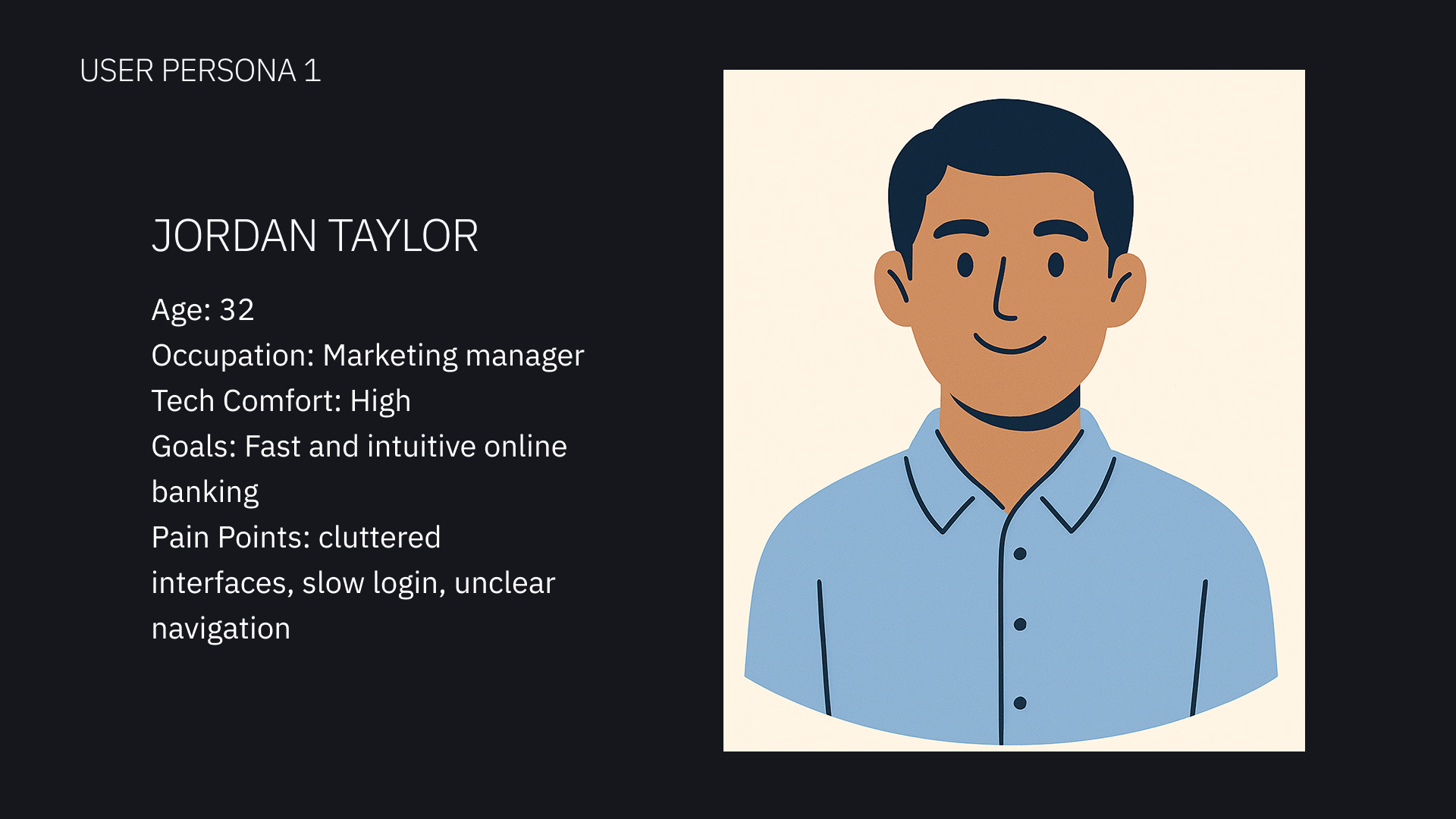
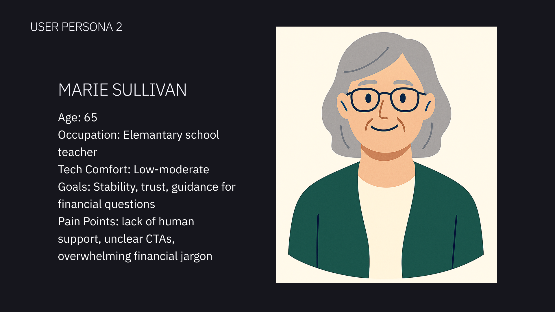
User Personas
I created two user personas to keep user empathy at the core of my project as I considered how to improve the website home page. I gave the personas very different characteristics that represented prominent groups of the intended audience for the bank website.
Pain Points
1
Cluttered Navbar
The site contains 3 different nav bar sections. This makes the navigation section cramped and overloaded with choices. A user would find too many options overwhelming and even discouraging.
2
Lacks Direction
Barely any CTAs for users to explore the services and options. This is a missed opportunity to increase user engagement.
3
Lacks Trust
The home page looks empty and uninviting. There is barely any info about the company, who they are, or what they do. For a financial institution, trust with the clients is everything.
How I’d expand on my research: If the project had a longer timeline, I would conduct surveys of real users about their experience with the current website. I would also conduct an in-depth competitive audit to identify where this site is falling short compared to similar companies, and any opportunities to stand out.
Goals
Streamline the navbar
Hook the user with engaging hero section
CTAs that are useful and convenient
Build trust with modern UI, helpful information, and intuitive page hierarchy
Make footer less of an eyesore, more of a tool
With the context my research provided, I identified 5 main goals so I could answer the assignment as thoroughly as possible.
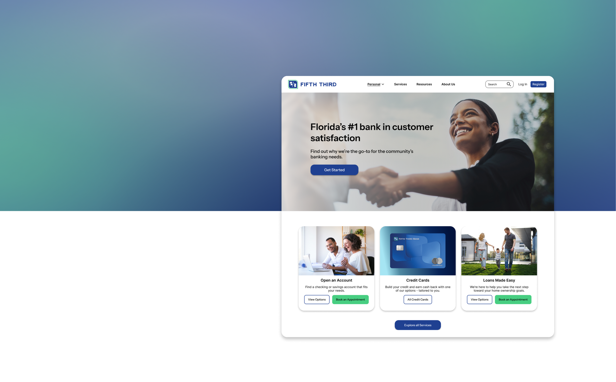
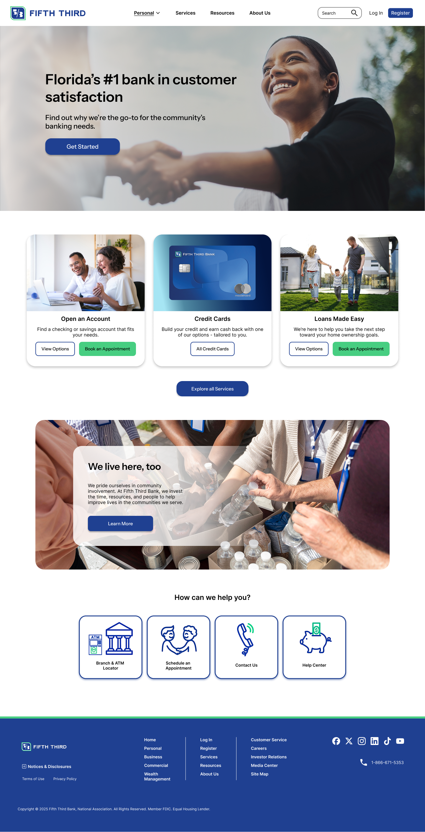
The Solution
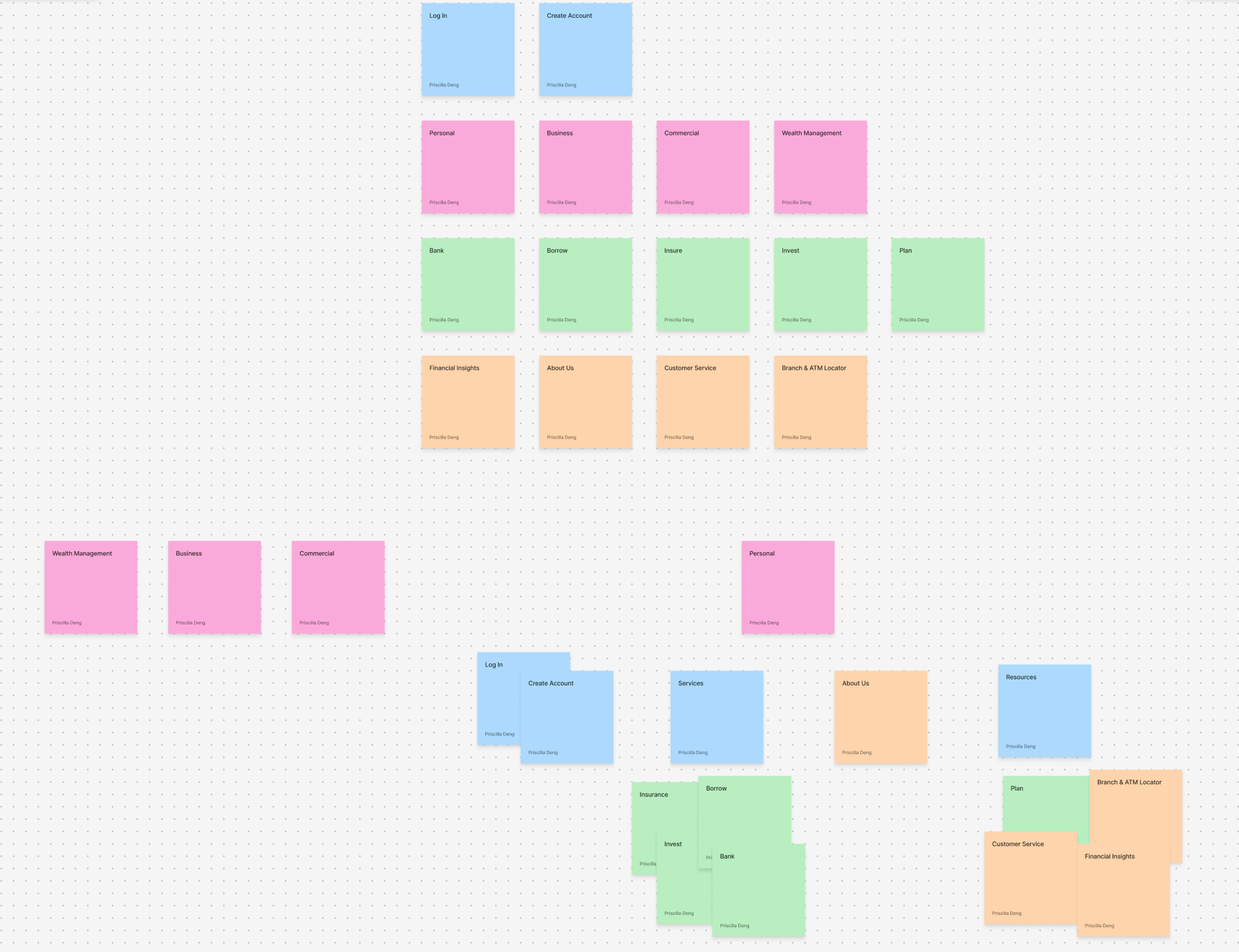
I started with card sorting to make sense of the information architecture.
I simplified the navbar into one line, grouping some of the options into dropdowns to save space while preserving intuitive organization
How I’d expand on this: surveys & user testing
Navbar
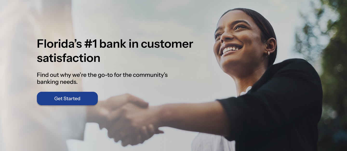
Hero Section
I highlighted the benefits and accolades to draw in the user.
“Ranked #1 in customer satisfaction” builds trust and rapport
The large image further emphasizes human connection and trust.
How I’d expand on this: I would explore more photos and graphic options, and consider creating a moving carousel.
I kept in mind that the CTAs on a site’s landing page should encourage the user to take the next steps.
My choices for the actions aligned with goals from the user personas
I used clear, direct wording
The styling deliberately causes the buttons to stand out from other page content
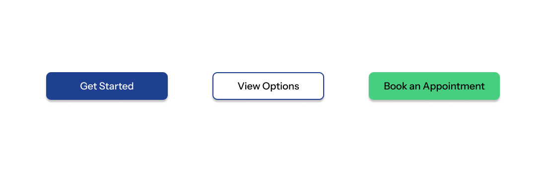
Calls-To-Action
Body
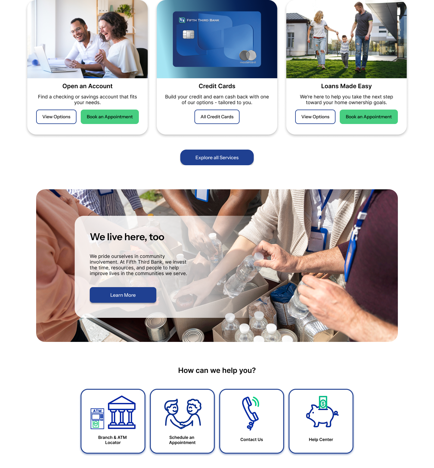
I asked myself what features are most useful on the home page and what questions users will want answered right away.
This section contains an overview of the most common services and resources.
I used a card-based design for intuitive and organizational purposes.
The UI is friendly, simple. It is modern without being confusing
How I’d expand on this: Surveys for what users would value on the home page, usability testing on my design to evaluate effectiveness.
Footer
I based my design off of site footer best practices and ease-of-use.
Utility links
Doormat navigation
Social media & contact
Copyright info
Reflections
If I were really working with this company to redesign their landing page, I would:
Emphasize research and usability testing above all else. It is crucial to gain the perspectives of real users, learn their needs, and design accordingly.
Spend more time optimizing the site for accessibility. I would perform an in-depth accessibility audit using WCAG guidelines.
Evaluate the strengths and weaknesses of the site using metrics like bounce rate, session duration, and conversion rate.
Next Steps
Not only did this project help land me a very rewarding internship role, it also gave me an opportunity to try my hand at redesigning an existing product. This differs from my previous case studies that were all original projects. It feels different to iterate on someone else’s previous solution rather than come up with everything from scratch. I’m grateful for anything that helps me expand my experience and perspectives in design.