
GreenLife HUB


Respect the earth, find your community
Overview
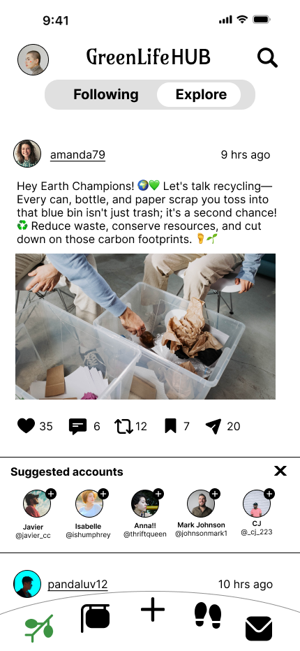
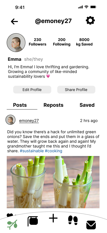
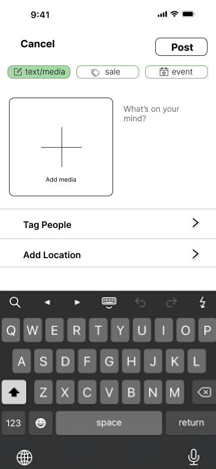
GreenLife HUB is a semester-long group project for my college course, User-Centered Design. It is a social media app that aims to make sustainability and eco-conscious living the basis of a like-minded online community. It offers other features like a second-hand sale finder and a tracker to help users improve their carbon footprint.
Problem Statement
Many people want to be more conscious about their environmental impact but don’t know how to. They also lack a community of like-minded individuals.
The Goal
Create an app that helps users, especially those who are environmentally conscious, live more sustainably.
Roles
Project manager, UI designer, Information architecture
Timeline
September 2023 - December 2023
Research
User Profiles
We want our app to be inclusive to everyone who is interested. Some of our target user profiles are:
Eco-conscious consumers
-Age range: 18 - 65
-Technology proficiency: low to high
Secondhand sellers and shoppers
-Age range: 18 - 65
-Technology proficiency: low to high
Environmental bloggers
-Age range: 25-40
-Technology proficiency: high
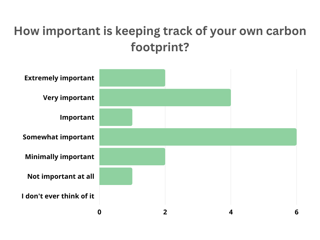
Survey
We conducted a survey of individuals who fit the demographics of our target users. Here are some of the questions and results:


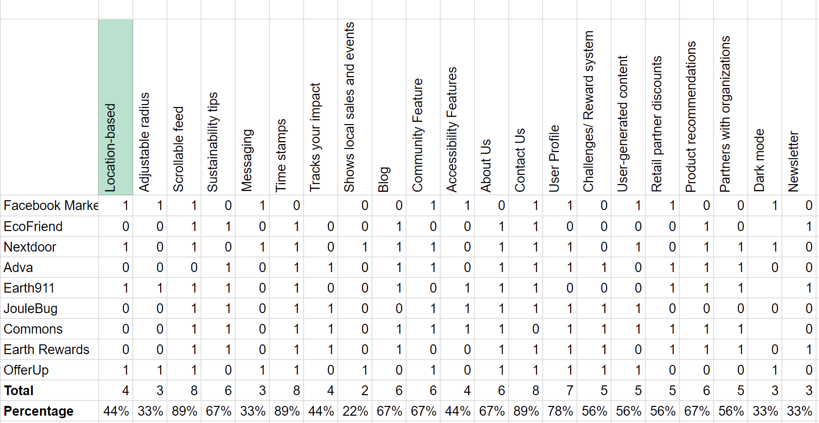
Competitive Audit
After analyzing and comparing various features of competing products, we found that a majority of the competitors had a scrollable feed, time stamps, and a contact section.
Other common features included sustainability tips, a blog, community feature, and product recommendations.
Only 22% showed local sales and events, which is a main focus of our app. This signaled to us a gap in the market that we could potentially fill.
Ideation
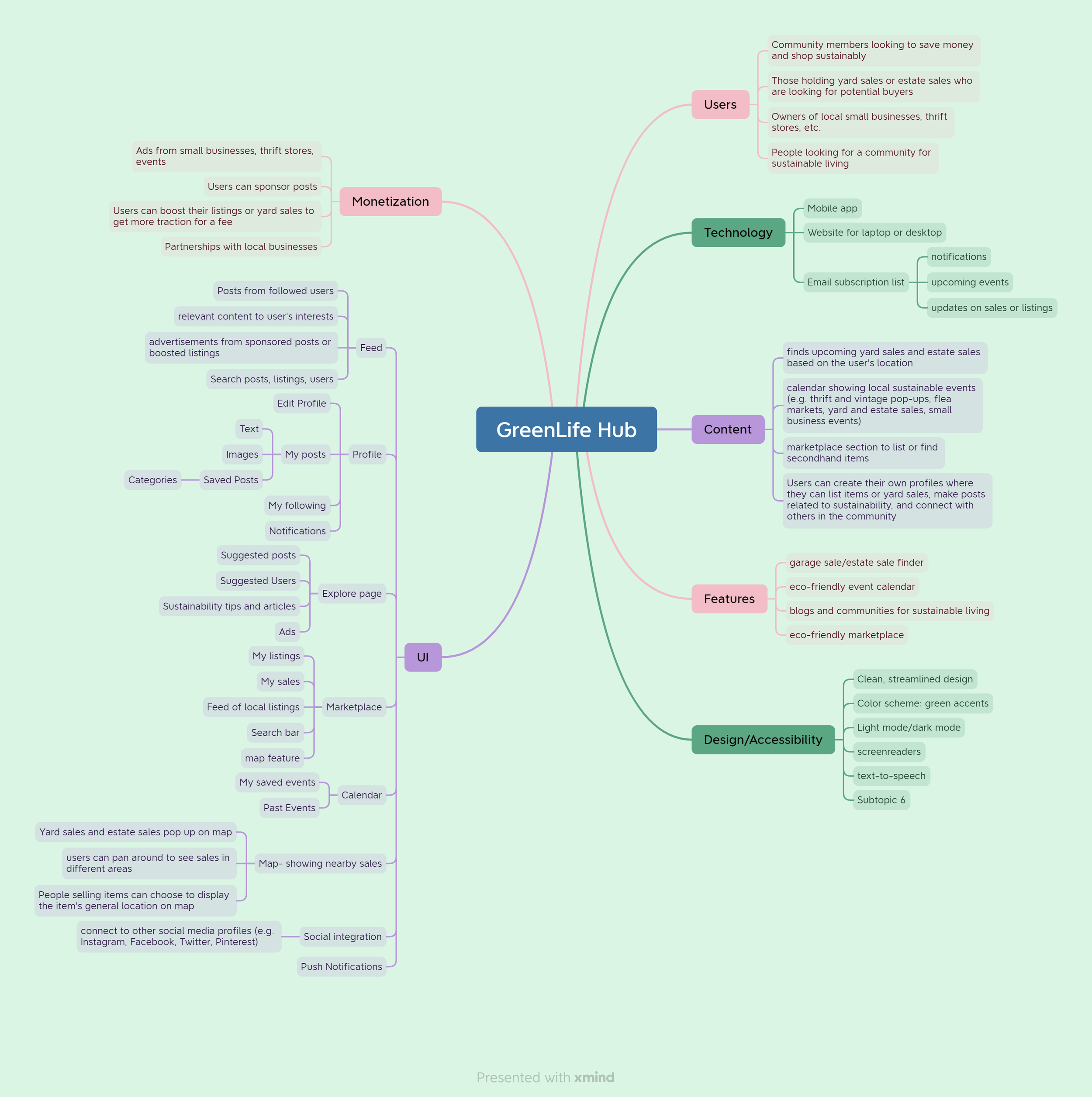
Mind Map
Navigation Site Map

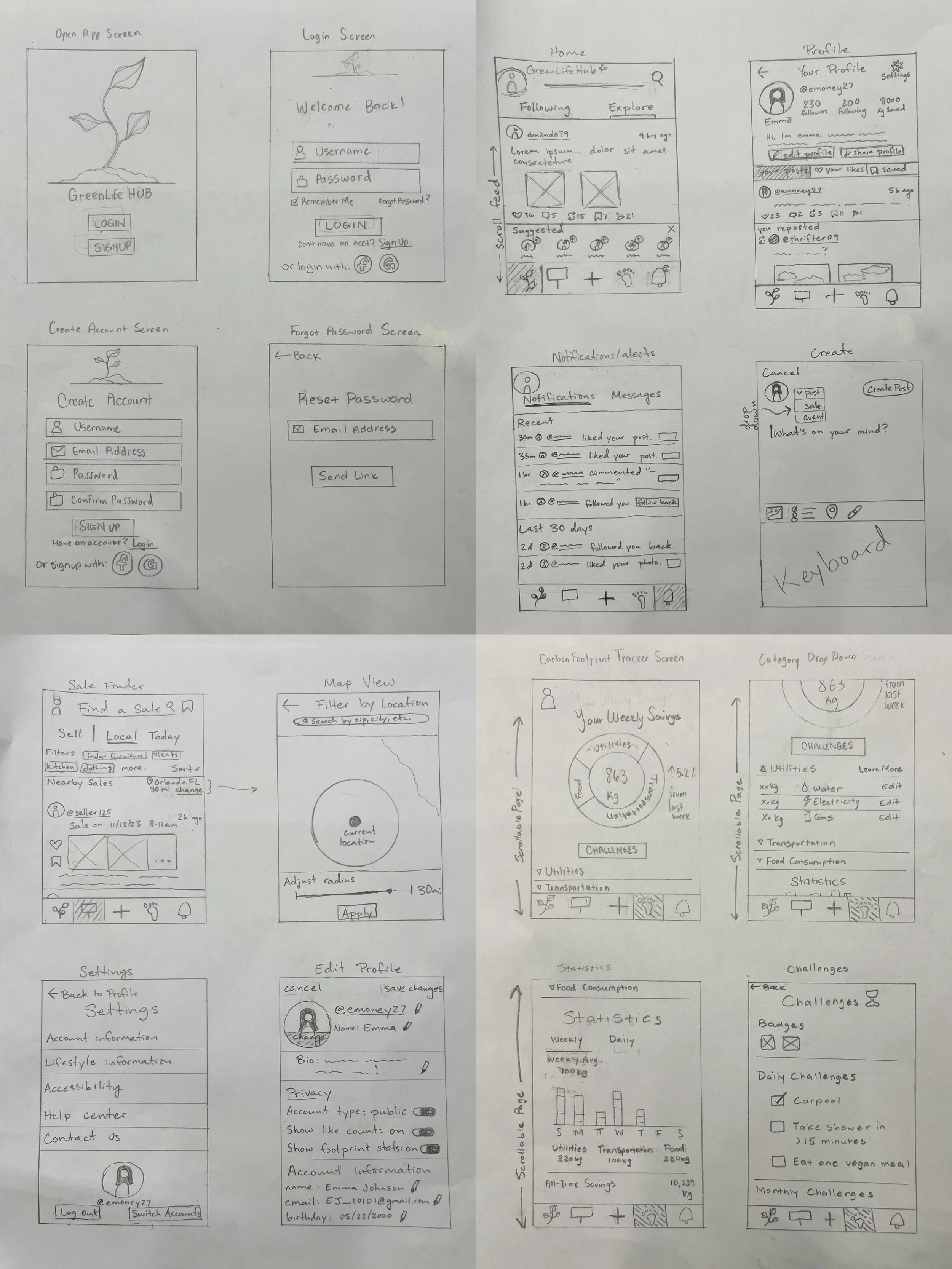
Paper Wireframes

Digital Prototyping
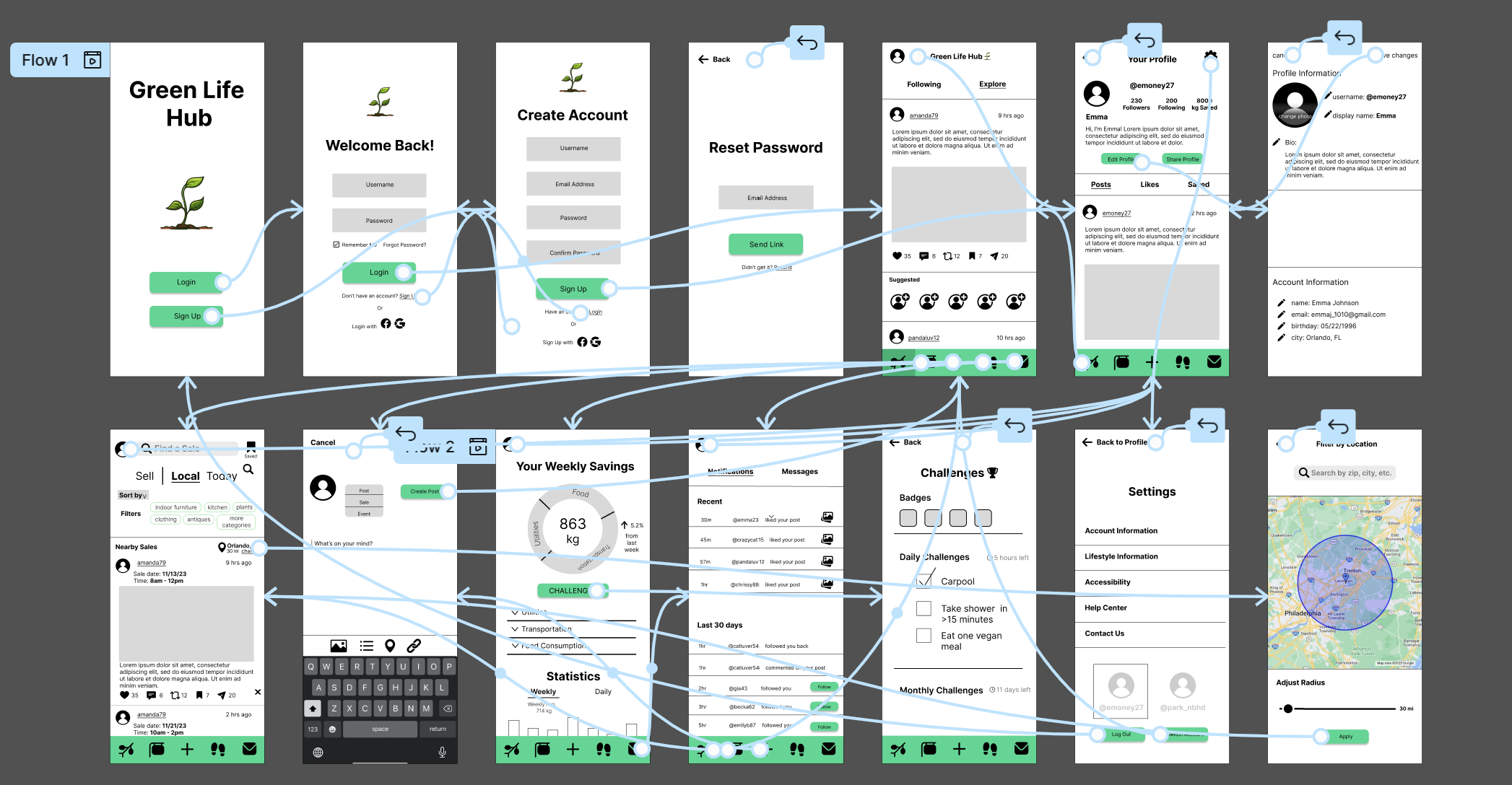
Low-Fidelity Prototype
Explore the low-fi prototype on Figma

High-Fidelity Prototype
Explore the high-fi prototype on Figma
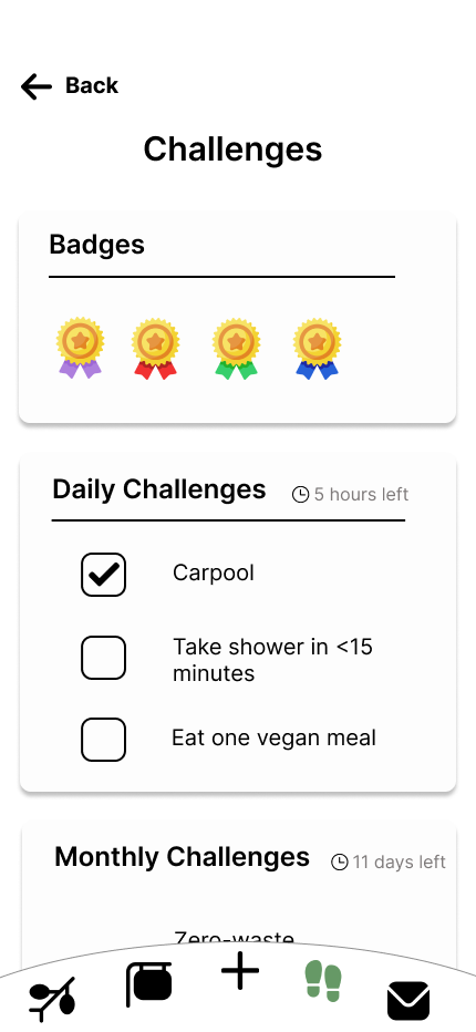
Final Mockups & Styling


Usability study
Parameters:
User Testing
-
Think aloud protocol
-
Remote
-
3 participants
-
1 - 3 minutes
Post-testing user interview questions
What is your favorite feature on the app?
What could be added to the app that would make you like it more?
Is there any part of the app that you find confusing? If so, explain why.
Would you recommend this app to a friend?
What is your least favorite feature on the app?
What did you find most surprising about this app?
How would you rate the usability (out of 5) of the app? Why?
Would you use this app everyday? Why or why not?
What we learned:
Users were able to identify the meanings of most icons
Some users are reluctant to use another social media app on a daily basis
Overall, our app has great usability
Buttons were well-sized and easy to press
Some users liked the similarity to other social media apps, but some did not
How we changed our design after testing:
Added the ability to hide like and follower count
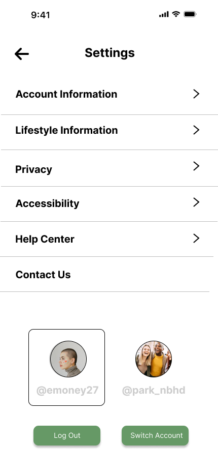
Added accessibility options
Reflections
I created a screen for users to customize accessibility options. These include light/dark mode, text size, button size, and captions for video content.
My team designed the social media screens of the app to be reminiscent of the organization and hierarchy of other popular social media apps. By doing so, users will be able to more quickly recognize similar features and feel comfortable navigating these screens.
We chose sans-serif fonts that are made to be more easily readable, especially on small screen sizes like smartphones.
Accessibility considerations
This was my first in-depth experience with a UX design project and it’s actually what sparked my interest in the field!
Impact
I learned a lot about working within a team for this project. Along the other group members, I figured out the best ways to communicate and collaborate. I really enjoyed working with my team and discovering the cool things we could make together.