

PocketChange: The App


Exchange rates made easy.
Overview
PocketChange is an app to calculate currency conversions and save converted values to lists for easy organization. This is an individual project I completed as part of the Google UX Design course.
Problem Statement
International travelers need a simple and reliable way to understand currency conversions and keep track of their expenses across different trips.
The Goal
Create an app that allows travelers to easily convert and track their expenses.
Roles
Everything (personal project): UX researcher, UX writer, information architect, UX designer, project manager, etc.
Timeline
August - November 2024
Research
Note: most of the research I conducted for the app and website versions of this product are the same. If you’d like to see how the end results differ, check out my case study for the PocketChange website!
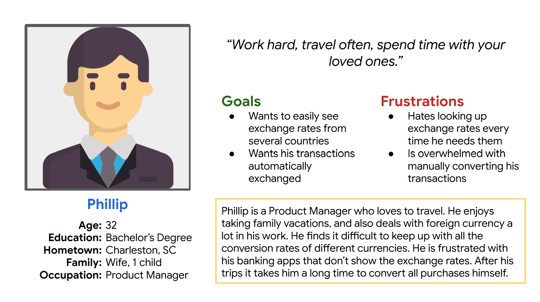
After consideration of the target audience, 3 user personas were created to represent different characteristics of several target users. These people have interaction with foreign currencies and need a quick and easy way to access transaction rates. It was helpful to develop these user personas and keep them in mind while making progress on this project.
User Personas


Pain Points
1
Many tabs open
Users are tired of making a new search when they need a conversion rate or looking through their existing tabs for a past conversion rate search.
2
Time-consuming
When users have many currency amounts to convert, it gets cumbersome and time-consuming to do them one by one.
3
Confusing
Conversion rates can be hard to understand at first, and most preliminary searches do not explain all the necessary information.
4
Hard to remember
Users are frustrated with trying to remember conversion rates off the top of their head, especially when dealing with several currencies or when rates change.
Competitive Audit
I compared 47 unique features across 9 different websites and apps that could be considered competitors of PocketChange. Here are some of the results:
44%
showed the corresponding symbols for each currency. I would like to include these for ease of use and understanding.
22%
had the feature to log past conversions. This is a great hole in the market to introduce our product that is all about saving converted items into lists for expense tracking purposes.
0%
allowed users to find nearby ATMs and exchange counters to get cash on the go. Including this feature would set PocketChange apart from its competitors.
Ideation
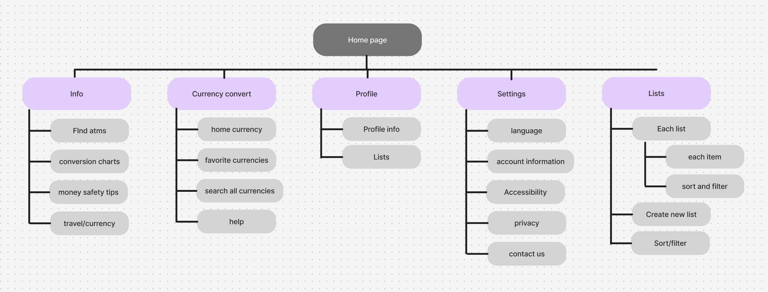
Sitemap
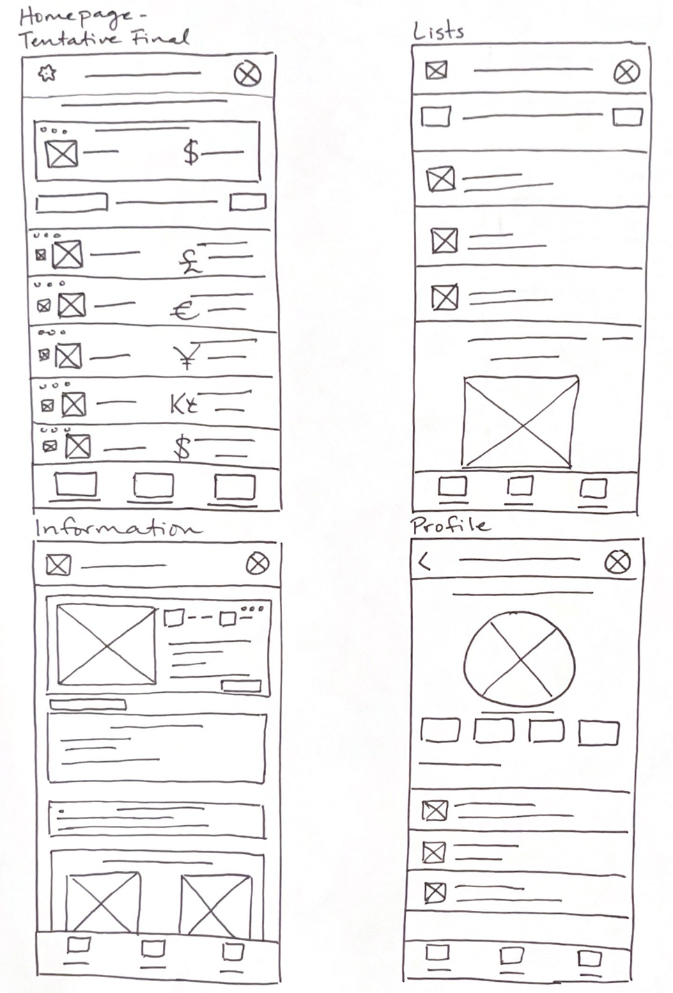
Paper Wireframes
I went through a few iterations of each screen with paper wireframes. The 4 main ones are pictured here.
These wireframes gave me a great place to start when I began to create digital wireframes.
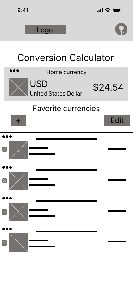
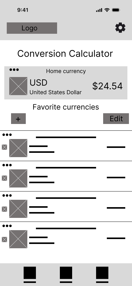
Digital Wireframes
I went through several iterations of digital wireframes before I moved on to prototyping. For each version, I experimented with layouts and content. I kept usability and accessibility concerns at the forefront of my mind.
Iterations of home screen

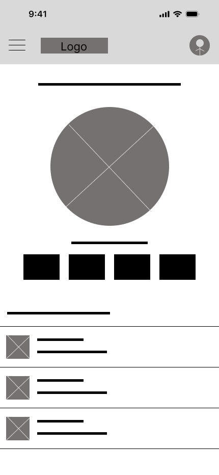
Iterations of profile screen


Parameters:
Usability Study
-
Moderated usability study
-
Orlando, FL
-
5 participants aged 20 - 56. One with ADHD, one with poor vision
-
8 - 10 minutes
Round 1 findings:
The conversion calculator needs to be more intuitive.
Adding information about traveling to different countries would be useful to users.
Almost all participants appreciate the option to locate ATMs, banks, and exchange counters.
Round 2 findings:
Most participants found that the color scheme is fitting and expected for a money-related app.
80% of participants said they would use this app on a foreign trip.
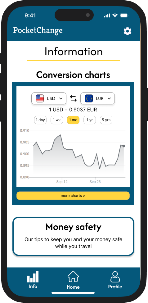
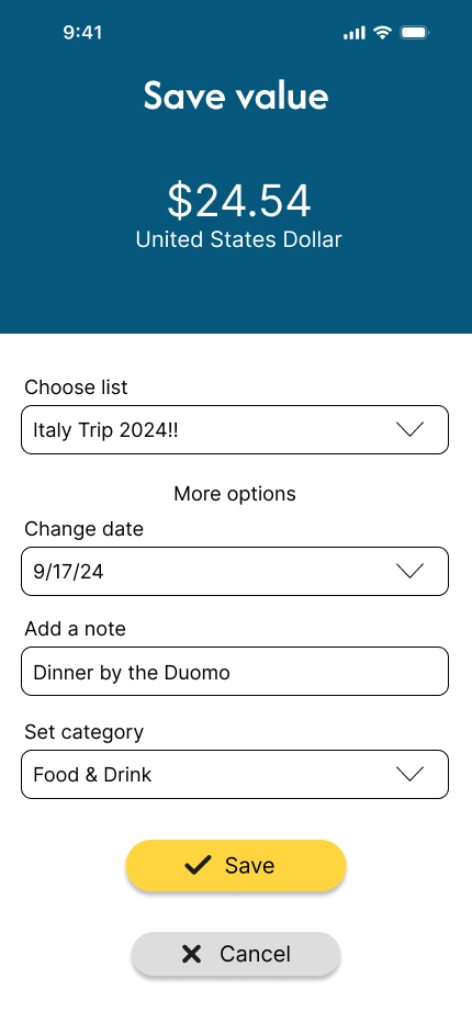
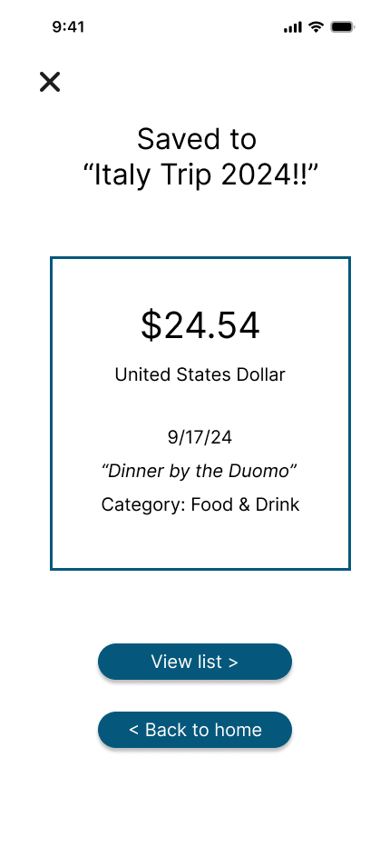
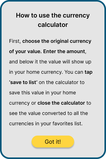
Final Mockups & Styling


Reflections
The Web Content Accessibility Guidelines suggests a ratio of at least 4.5:1 between foreground and background colors. I made sure each element of the app had a ratio of at least 7:1 for optimal contrast.
Content was arranged in a logical order to maintain meaningful sequence throughout the app.
Clear headings were used in each screen in the app to make each screen easily understandable.
Accessibility considerations
From a participant in the user testing process: I could’ve used this when I was traveling last year. It would have made my life so much easier.”
Impact
Throughout this personal project I have learned so much. I gained more experience with user personas, got more practice designing mockups and prototyping in Figma, and honed my skills as a user testing facilitator.